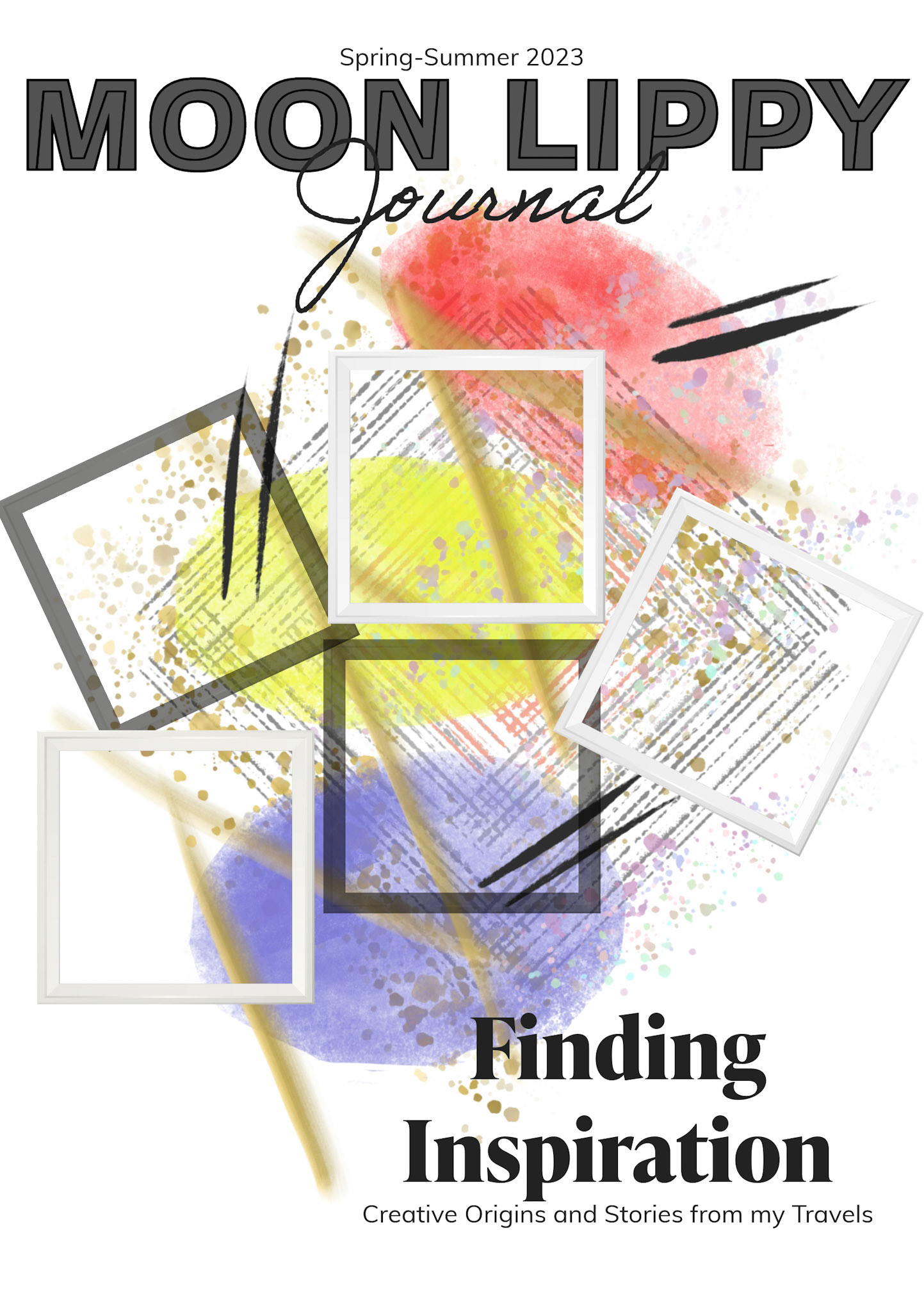
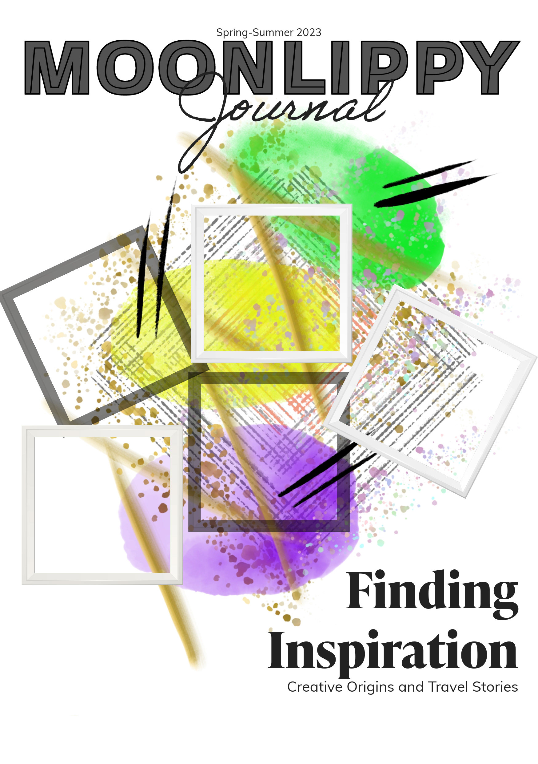
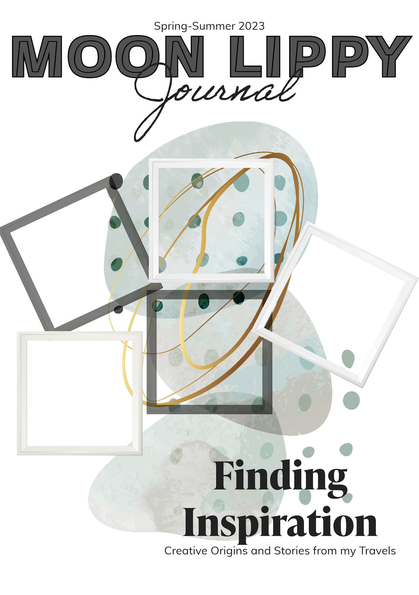
My cover page initially featured a random decorative element sourced from Adobe Express, and it immediately resonated with me. I sought an abstract design, devoid of specific meaning (as discussed in one of my features), aiming for something that evoked a sense of visual pleasure. The vivid green hues and the delicate watercolor effect, along with the mesmerizing specks of gold, appeared as if they had been spontaneously dribbled and swirled onto the canvas, ultimately forming a captivating circle.
However, following my talk on digital art and the idea that one can achieve anything with the available tools—a "walk the talk" philosophy—I felt compelled to create something original. Thus, at the eleventh hour, I embarked on crafting a fresh design, drawing inspiration from the original cover photo. My intent was to incorporate primary colors while giving a slightly purplish twist to the blue, and then changed again, it had a lot of iterations. The goal remained to produce a vibrant composition, preserving the enchanting essence of gold with a graceful watercolor splash.
Is it excessive to provide explanations for every element? At first, I contemplated filling the frames with photographs, but my search for the perfect images proved fruitless. It was then that I had an epiphany: this inaugural edition was all about "discovering inspiration." So, I decided to leave the frames empty. This decision marks the beginning of an evolution towards something magical!
I am just delighted with the final outcome.
OLD VERSION